7.11. Area Between Curves and the Gini Index#
Areas under curves called probability distributions can be used to represent probabilities. Another way to use area is to represent an inequitable distribution of resources as the area between two curves.
7.11.1. Computing Area Between Two Curves#
Suppose \(f(x)\le g(x)\) on an interval \(a\le x \le b\). Then the area \(A\) between the graph of \(y=f(x)\) and \(y=g(x)\) on the interval \(a\le x \le b\) is given by the definite integral.
Example#
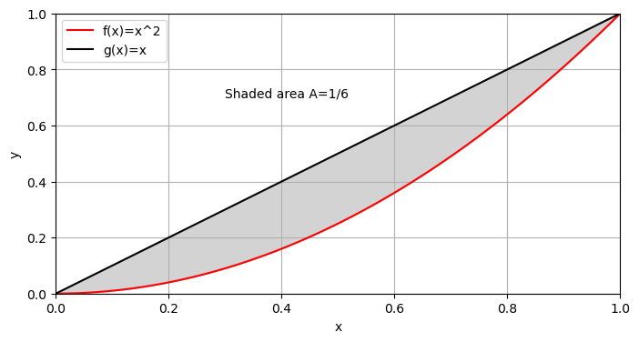
Find the area \(A\) between \(f(x)=x^2\) and \(g(x)=x\) on the interval \(0\le x \le 1.\)
Solution.
Show code cell source
import matplotlib.pyplot as plt
import numpy as np
plt.figure(figsize=(8, 4))
plt.xlim((0,1.))
plt.ylim((0,1.))
x=np.linspace(0,1,100)
f=x**2
g=x
plt.plot(x,f,color='r',label='f(x)=x^2')
plt.plot(x,g,color='k',label='g(x)=x')
plt.fill_between(x,f,g,color='lightgray')
plt.grid()
plt.legend()
plt.xlabel("x")
plt.ylabel("y")
plt.text(.3,.7,"Shaded area A=1/6")
plt.show()
7.11.2. Lorentz Curve and GINI Index#
Consider the following NBA salary data:
Player |
Salary |
|---|---|
S Curry |
45,780,966 |
K Thompson |
37,980,720 |
A Wiggins |
31.579.390 |
D Green |
24,026,712 |
J Wiseman |
9,166,800 |
The salaries are clearly not evenly distributed between the five starting players. To measure the degree of uneven distribution, we first make a plot of what is known as a Lorentz curve.
Show code cell source
plt.figure(figsize=(8, 4))
plt.xlim((0,5.2))
plt.ylim((0,1.2))
#--plot the Golden State Warrior salaries-----
GS=[0,1,2,3,4,5]
yGS=[0,.06,.22,.44,.69,1]
plt.plot(GS,yGS,marker='o',color='r',label='Golden State')
#--equity line
x=[0,1,2,3,4,5]
y=[0,.2,.4,.6,.8,1]
plt.plot(x,y,color='k',label='Perfect Equity')
plt.gca().set_xticks(np.arange(1,6,1))
plt.grid()
plt.legend()
plt.xlabel("sum of lowest n paid starting players")
plt.ylabel("proportion of total salary")
plt.show()
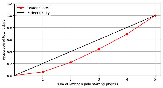
The Lorentz curve plotted in red in this case tells us that the lowest paid starter received .06 = 6% of the total starting 5 salary. This is indicated by the red point at (1,.06). The 2 lowest paid starters received .22 of the salary total. This is indicated by the red point at (2, .22). The 3 lowest paid starters received .44 of the total. This is indicated by the red point at (3, .44). The 4 lowest paid starters received .69 of the total. This is indicated by the red point at (4, .69). The final point must be (5,1) since the 5 starters account for 100% of the total starting salary.
Note that the least inequity occurs when the Lorentz curve coincides with the line \(y=x\). In this case, the area \(A\) between \(y=x\) and the Lorentz curve is equal to zero (\(A=0\)).
The greatest inequity occurs if one person receives everything and the rest nothing. In this case, the area \(A\) between \(y=x\) and the Lorentz curve is one-half (\(A=1/2\)).
The GINI index G.I. measures iniquity as \(G.I.=2A\) so that \(0\le G.I. \le 1\).
The larger the value of the GINI index, the greater the inequity.
7.11.3. Exercises#
Exercises
Suppose the Lorentz curve for Profession 1 is \(L_1(x)=x^{1.7}\) and the Lorentz curve for Profession 2 is \(L_2(x)=.8x^2+.2x.\)
Compute the GINI index of both profession 1 and profession 2 to determine which has the more even income distribution.
Plot the Lorentz curve for each profession and shade the area \(A\) between the curve and the line \(y=x\) for each profession.