import math
import numpy as np
import matplotlib.pyplot as plt
import random
random.seed()
5.5. Probability Distributions#
A probability distribution is a mathematical function that maps each possible numerical outcome \(X\) of an experiment to its probability. Probability distributions come in many different types. Some fundamental ones include uniform, normal and binormal.
5.5.1. Uniform distribution#
The graph of a uniform distribution could look like this:

In the uniform distribution, each value along the horizontal axis is equally probable.
Mathematical distributions are important. We use them to determine probabilities for results of certain random experiments and to approximate real frequency distributions.
For example, if we use Python to generate a random integer between 1 and 6, the number is selected from a uniform distribution: Each outcome is equally likely. We see a possible output below.
print(random.randint(1, 6))
6
A histogram is a visualization of a frequency distribution: It shows how often a random variable takes on a value. It shows the shape, center, and spread.
For example, consider the simulation of rolling a die 6000 times. We can capture the results with a histogram in Python using the matplotlib.pyplot package. Matplotlib contains a variety of functions to create visualizations of data. It captures the functionality of the proprietary Matlab.
In this section we use the Numpy package. It provides tools for numerical computing, e.g., efficient numerical vector/array calculations based on underlying libraries in the Fortran and C programming languages.
Here we call the hist method on the data values that fall in the range 1 to 7 inclusive, where each bar has width 0.8 using . Experiment to see how this call is an improvement over plt.hist(values) and plt.hist(values, bins = 6) and plt.hist(values, bins = 6, rwidth = 0.8). We improve the layout of the bars by specifying the leftmost and rightmost values.
values = [] # Work with list or array.
for i in range(6000): # Roll the die 6000 times.
    roll = random.randint(1, 6)
    values.append(roll)
# Plot a histogram of the values.
plt.hist(values, bins = range(1, 8), rwidth = 0.8)
# The leftmost edge is 1, and the rightmost is 7.
plt.xlabel('Outcome')
plt.ylabel('Number of times')
plt.show()
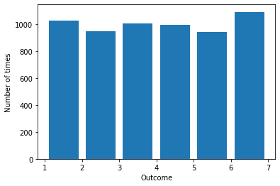
The results of the simulation of 6000 die rolls look approximately uniform with some slight differences in the frequencies of the rolls of the six numbers.
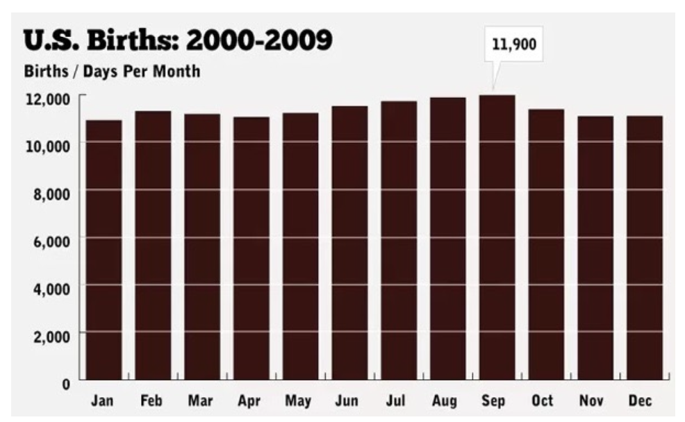
The uniform distribution approximates real data, like births by month, as shown in the figure. The real data for the years shown in the figure have some slight month-to-month differences.
5.5.2. Normal distribution#
A probability distribution can be discrete or continuous, depending on whether it maps a discrete value or a continuous value \(X\) of an experiment to its probability. A numerical variable is discrete if there are jumps between the possible values. A numerical variable is continuous if it can take on any real-number value between two other values.
The data in the previous examples are discrete. There is a jump of 1 between each possible value on the die. There is a jump of 1 between each possible number of births per month. We cannot roll a 3.72 on a die or have 10,007.21 births per month.
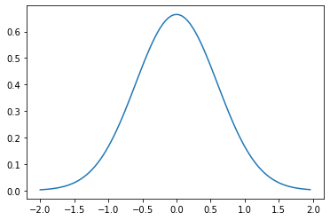
The graph of a normal distribution or Gaussian distribution could look like this:
In the normal distribution, the values in the middle ranging along the horizontal axis are more probable than at the ends (“in the tails”) of the distribution. The normal distribution is often called a “bell curve” because it is shaped like a bell.
The distribution could be discrete. The continuous form of the normal distribution
where \(\mu\) is the mean, and \(\sigma\) is the standard deviation, can be graphed in Python as:
def plot_normal_curve(start, end, mu, sigma):
    # Plot the normal distribution with mean mu and standard deviation sigma on an interval from start to end.
    y_coords = []
    x_coords = np.arange(start, end, (end-start)/100) # Use 100 points between start and end.
    for x in x_coords:
        y_coords.append(1/sigma/math.sqrt(2*math.pi)*math.exp(-1/2 * ((x-mu)/sigma)**2))
    plt.plot(x_coords, y_coords)

plot_normal_curve(-2, 2, 0, 0.6)
Distributions, such as the normal distribution, are useful for determining probabilities for results of certain random experiments, e.g., in mathematical statistics. Statistics is the science of collecting and analyzing data in large quantities, especially for making inferences about a whole population from a representative sample.
For example, how can we estimate the average height of all women in the country? Here the population is women in the country. The average height is the expected value or population parameter.
Sample some women at random. Measure them and average their heights to get the sample average or sample mean.
Repeat the process of sampling, measuring, and averaging.
Average the average heights for the samples.
The Law of Large Numbers could be casually stated as: The sample averages converge to the expected value, as the number of samples is increased.
The Central Limit Theorem could be casually stated as: The distribution of the sample statistic is approximately normal, if the sample size is large enough.
A sample statistic could be a sample mean for a numerical variable (like the average height of a sample of people) or a sample proportion for a categorical variable (like the proportion of adults in a sample of people who are in the “yes” category for the variable that measures completion of a sixth-grade education). Note that for numerical variables, quantities like the average, sum, or difference of their values have clear meaning. The possible values of categorical variables are called “levels”, such as the yes/no “levels”.
Experiment with / illustrate the law and theorem using Python.
def flip(num_flips):
head_count = 0
for i in range(num_flips):
if random.choice(('H', 'T')) == 'H':
head_count += 1
return head_count/num_flips
def flip_trials(num_flips_per_trial, num_trials):
# Return the proportions of heads in num_trials trials of num_flips coin flips.
# Return the mean of the proportions.
fraction_heads = []
for i in range(num_trials):
fraction_heads.append(flip(num_flips_per_trial))
mean = sum(fraction_heads) / len(fraction_heads)
return fraction_heads, mean
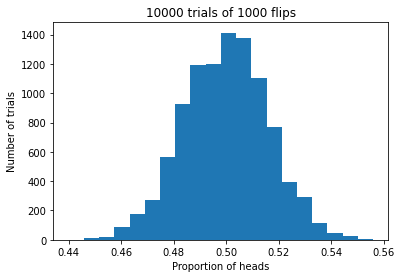
def make_histogram_of_proportions(num_flips, num_trials):
# Make a histogram of the proportions of heads in num_trials trials of num_flips coin flips.
plt.title(f'{num_trials} trials of {num_flips} flips')
plt.xlabel('Proportion of heads')
plt.ylabel('Number of trials')
proportions_heads, mean_of_proportions = flip_trials(num_flips, num_trials)
plt.hist(proportions_heads, bins = 20)
xmin, xmax = 0.4, 0.6
plt.figure()
print(f'The mean of the proportions is {mean_of_proportions}.')
make_histogram_of_proportions(1000, 10_000)
The mean of the proportions is 0.49986099999999817.
<Figure size 432x288 with 0 Axes>
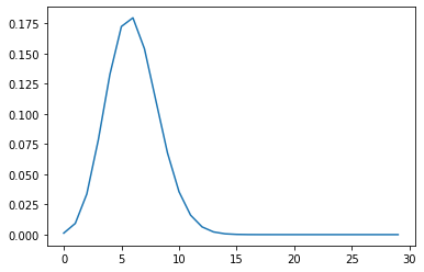
5.5.3. Binomial distribution#
Consider a fixed number \(n\) of independent experiments, where each experiment can result in “success” with the same probability \(p\). The binomial distribution maps the non-negative integer \(k\) to the probability of achieving exactly \(k\) successes in \(n\) experiments.
The graph of a binomial distribution could look like this:

The distribution is discrete. The binomial distribution
can be graphed in Python as:
def plot_binomial_curve(n, p):
    # Plot the binomial distribution for n independent trials, each with probability p of success.
    y_coords = []
    for k in range(n):
        y_coords.append(math.factorial(n)/math.factorial(k)/math.factorial(n-k) * p**k * (1-p)**(n-k))
    plt.plot(np.arange(0, n, 1), y_coords) # Plot x-coordinates 0, 1, 2, 3, ..., n against y-coordinates.

plot_binomial_curve(30, 0.2)
5.5.4. Exercises#
Exercises
Exercise 1: Consider points \((x, y)\) in a 1 x 1 square in the first quadrant of the plane \((x, y) \in [0, 1) \times [0, 1)\). Simulate filling the square with dots by picking points in the square at random. Generate the coordinates in each \(x\)-\(y\) pair by using Python to sample from a uniform distribution on the interval [0, 1). Use the ratio of number of dots inside a quarter circle with center at the origin to total dots to simulate the ratio of the area of the quarter circle to the area of the square. Use this ratio to to estimate the value of \(\pi\).
Exercise 2: Use Python to simulate a game board in which 10,000 balls are dropped down onto a triangle of ten levels of pegs, one-by-one. Level 1 has 1 peg. Level 2 below it has 2 pegs, etc., down to 10 pegs at Level 10 at the bottom. Assume each ball has equal probability of moving to the left or to the right at each level.
(a) Plot the number of balls against the landing-peg number. Include a descriptive title and labels for both axes on your plot.
(b) How does the graph tend to change if you use more levels and keep the number of balls the same? Why?
(c) How does the graph tend to change if you use more balls and keep the number of levels the same? Why?
Hint: To keep a record of how many balls land in each position, start with a list or array total_balls, consisting of ten zeroes. For each of 10,000 trials (each drop of a ball), start a current_position variable for the ball at 0. Loop through levels 1 to 9. (Start at Level 1 and go up to and not including the bottom row.) Increment current_position by random.randrange(2) at each level to represent a drop to the next level, where, say, 0 represents a move left, and 1 represents a move right. When you’re done with all levels, increment the ball total at the index corresponding to the position where the ball ended up using, say, total_balls[current_position] += 1.
Exercise 3: Consider a biased coin that lands on heads 20% of the time. Simulate 30 flips of the coin. Record whether no heads were flipped, 1 head was flipped, 2 heads were flipped, 3 heads were flipped, etc., up to 30 heads. Repeat the experiment 10,000 times. Draw a histogram that shows how often each number 1-30 of heads was flipped. Describe the shape and spread of the graph. Compare it to the graph of the mathematical distribution given by the formula.
Hint: Note that one way to simulate the flip of a fair coin, is as shown in the cell below because a random number generated in the left half of the interval \([0, 1)\) represents a flip of heads, and a random number generated in the right half of the interval represents tails:
With a different value of \(p\) than 0.5, you can simulate the flip of a coin biased to come up heads with a probability of \(p\). You can increment a variable heads_counter (initialized to 0) with each simulated flip of the coin that comes up heads to check that your simulation performs as intended.
p = 0.5
if random.uniform(0, 1) < p:
    print("You flipped heads!")
else:
    print("You flipped tails!")
You flipped tails!