4.9. Solutions to Part II Exercises#
Exercise 7.1
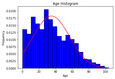
#make a histogram for the age column in df
plt.hist(df['age'], bins = 20, color = 'blue', edgecolor = 'black', density=True)

#add normal distribution
mu = df['age'].mean()
sigma = df['age'].std()
x = np.linspace(df['age'].min(), df['age'].max(), 100)
y = 1/(sigma * np.sqrt(2 * np.pi)) * np.exp( - (x - mu)**2 / (2 * sigma**2))

plt.plot(x, y, color = 'red')

plt.title('Age Histogram')
plt.xlabel('Age')
plt.ylabel('Frequency')
plt.show()

Exercise 7.2
#removing "other" entries in gender
intermediate_client_atts = client_attributes[client_attributes['GENDER'] != '99~Other']

m = intermediate_client_atts[intermediate_client_atts['GENDER'] == '1~Male']['num_services']
f = intermediate_client_atts[intermediate_client_atts['GENDER'] == '2~Female']['num_services']

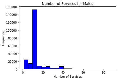
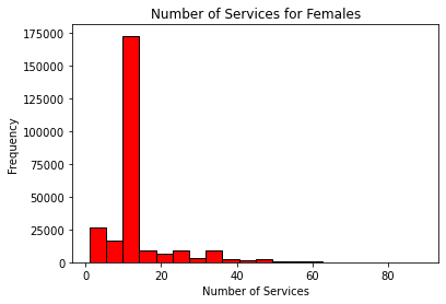
#make a separate histogram for both m and f
plt.hist(m, bins = 20, color = 'blue', edgecolor = 'black')
plt.title('Number of Services for Males')
plt.xlabel('Number of Services')
plt.ylabel('Frequency')
plt.show()

plt.hist(f, bins = 20, color = 'red', edgecolor = 'black')
plt.title('Number of Services for Females')
plt.xlabel('Number of Services')
plt.ylabel('Frequency')
plt.show()


Interpretations may vary. While some students may say these look normal given a large number of observations tending around the mean, others may say that due to large-valued outliers, these distributions are not normal. Students are encouraged to perform follow-up statistical Shapiro-Wilk tests.
EDA Project
One example of an EDA report can be found at this link.
https://drive.google.com/file/d/1d-LnndIL3gS9dJbKraxRWPv-fEgNcfkB/view?usp=sharing

