Show code cell source
import pandas as pd
import numpy as np
import matplotlib.pyplot as plt
4.1. The Great Migration#
DATASETS:
migration.xlsx (source https://www.census.gov/dataviz/visualizations/020/508.php); uscities.xlsx ((https://simplemaps.com/data/us-cities))
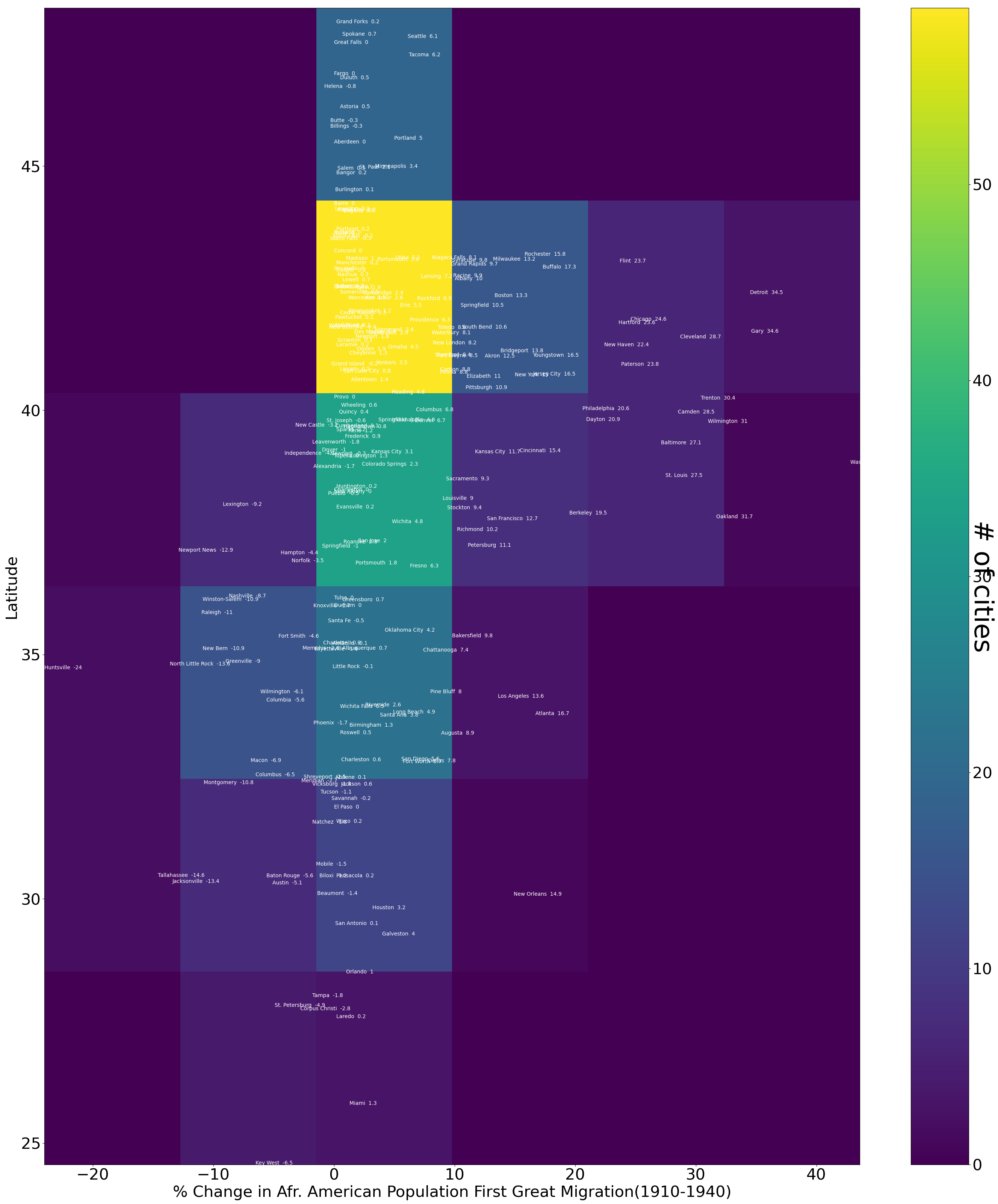
SUMMARY: We create a heat map to show the %change in African Americans living in cities in the Northern and Southern USA as a result of the Great Migrations. Those with the largest increase (over 20%) were all in the North.
BACKGROUND: Isabel Wilkerson gives a good introduction to the Great Migration. (Run the next cell)
from IPython.display import YouTubeVideo
YouTubeVideo('n3qA8DNc2Ss')
4.1.1. Creating a Dataframe with %Changes in African American Population by (Lat,Lon) Location#
Use pandas to import the datafile migration.xlsx into a dataframe called migration.
migration=pd.read_excel('migration.xlsx')
Display the first two rows of migration.
migration.head(2)
| City and State | Percentage-point change in Black population 1940-1970 | Percentage-point change in Black population 1910-1940 | |
|---|---|---|---|
| 0 | Aberdeen, SD | -0.5 | 0 |
| 1 | Abilene, TX | -0.8 | 0.1 |
Shorten the column names (MIg1=1st Great Migration, Mig2=2nd Great Migration), separate the City and State, and create a multi-index with city and state.
Show code cell source
migdf=migration #make a copy of the original dataframe
migdf.columns=["City","Mig2","Mig1"] #rename the columns
migdf["city"]="city"  #create a column for the city
migdf["state"]="state"  #create a column for the state
for m in migdf.index:
    x=migdf.loc[m,"City"].split(", ")  #split the city from the state
    migdf.loc[m,"city"]=x[0]  #add the city to the city column
    migdf.loc[m,"state"]=x[1]  #add the state to the state column
migdf.drop(['City'], axis=1, inplace=True) #Drop the original City column
migdf=migdf.set_index(["city","state"],drop=True) #create multi-index
migdf.head(5)
| Mig2 | Mig1 | ||
|---|---|---|---|
| city | state | ||
| Aberdeen | SD | -0.5 | 0 |
| Abilene | TX | -0.8 | 0.1 |
| Akron | OH | 4.1 | 12.5 |
| Albany | NY | 1.2 | 10 |
| Albuquerque | NM | -0.7 | 0.7 |
Read the lat lon data for US cities in the file “uscities.xlsx” and make [“city”,“state”] the multi-index.
Show code cell source
rawlatlon=pd.read_excel("uscities.xlsx") #read data
latlon=rawlatlon[["city_ascii","lat","lng","state_id"]] #select columns
latlon.columns=["city","lat","lon","state"] #rename columns
latlon=latlon.set_index(["city","state"],drop=True) #create multi-index
latlon.head(2)
| lat | lon | ||
|---|---|---|---|
| city | state | ||
| South Creek | WA | 46.9994 | -122.3921 |
| Roslyn | WA | 47.2507 | -121.0989 |
We’ll perform an inner join (intersection) of the two dataframes migdf and latlon. This will add the lat lon data to the migdf data
df=pd.merge(latlon,migdf, how='inner', left_index=True,right_index=True)
df.columns=["lat","lon","Mig2","Mig1"]
df.to_excel("GM.xlsx")
df.head(5)
| lat | lon | Mig2 | Mig1 | ||
|---|---|---|---|---|---|
| city | state | ||||
| Seattle | WA | 47.6211 | -122.3244 | 0.1 | 6.1 |
| Spokane | WA | 47.6671 | -117.4330 | -0.2 | 0.7 |
| Tacoma | WA | 47.2431 | -122.4531 | -0.3 | 6.2 |
| New Castle | DE | 39.6685 | -75.5692 | -2 | -3.2 |
| Wilmington | DE | 39.7415 | -75.5413 | 2.3 | 31 |
Check for missing data.
df[df["Mig1"]=="No data"].count()
lat     6
lon     6
Mig2    6
Mig1    6
dtype: int64
df[df["Mig2"]=="No data"].count()
lat     14
lon     14
Mig2    14
Mig1    14
dtype: int64
Remove rows with missing data.
df.count()
lat     245
lon     245
Mig2    245
Mig1    245
dtype: int64
df=df[df["Mig1"]!="No data"]
df=df[df["Mig2"]!="No data"]
df.count()
lat     231
lon     231
Mig2    231
Mig1    231
dtype: int64
4.1.2. Creating a Map from our Dataframe#
Make a heat map of the 1st Great Migration.
Show code cell source
fig=plt.figure(figsize=(35, 40))
X=df["Mig1"].astype(float)
Y=df["lat"]
heat_map= plt.hist2d(X, Y, bins=6) #heat map is a 2dimensional histogram
plt.xlabel("% Change in Afr. American Population First Great Migration(1910-1940)",size=30)
plt.ylabel("Latitude",size=30)
plt.yticks(fontsize=30)
plt.xticks(fontsize=30)
names=df.reset_index()
for i in names.index:   ##add the names of the cities and %change in Afr. American population
    plt.text(names.Mig1[i],names.lat[i],names.city[i]+'  '+str(names.Mig1[i]),fontsize=10,color='white')
cbar = plt.colorbar()
cbar.set_label('# of cities', rotation=270,size=50)
cbar.ax.tick_params(labelsize=30)
fig.savefig("Migration1.png")
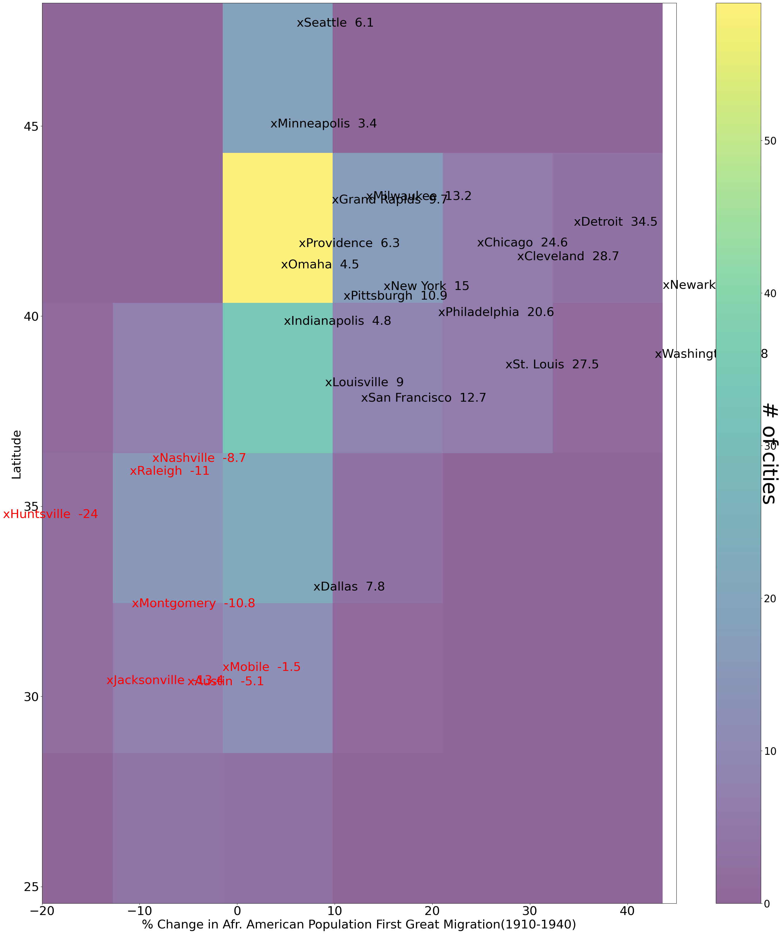
Improve clarity by specifying certain cities to disiplay.
fig,ax=plt.subplots(figsize=(35, 40))
X=df["Mig1"].astype(float)
Y=df["lat"]
heat_map= plt.hist2d(X, Y, bins=6,alpha=.6) #heat map is a 2dimensional histogram
plt.xlabel("% Change in Afr. American Population First Great Migration(1910-1940)",size=30)
plt.ylabel("Latitude",size=30)
plt.yticks(fontsize=30)
plt.xticks(fontsize=30)
plt.xlim(-20,45)
names=df.reset_index()
for i in names.index:   ##add the names of the cities and %change in Afr. American population
    if names.Mig1[i]<0 and any(names.loc[i,'city'] in x for x in ["Austin","Chicago","Detroit","Cleveland","Dallas","Denver","Grand Rapids","Houston","Huntsville","Indianapolis","Jacksonville","Louisville","Miami","Milwaukee","Minneapolis","Montgomery","Mobile","Nashville","New York","New Orleans","Newark","Omaha","Philadelphia","Pittsburgh","Providence","Raleigh","San Antonio","San Francisco","Seattle","St. Louis","Washington, DC",]):
        plt.text(names.Mig1[i],names.lat[i],"x"+names.city[i]+'  '+str(names.Mig1[i]),fontsize=30,color='red')
    else:
        if any(names.loc[i,'city'] in x for x in ["Chicago","Detroit","Cleveland","Dallas","Grand Rapids","Indianapolis","Louisville","Milwaukee","Minneapolis","Montgomery","Nashville","New York","Newark","Omaha","Philadelphia","Pittsburgh","Providence","Raleigh","San Francisco","Seattle","St. Louis","Washington, DC",]):
            plt.text(names.Mig1[i],names.lat[i],"x"+names.city[i]+'  '+str(names.Mig1[i]),fontsize=30,color='black')

cbar = plt.colorbar()
cbar.set_label('# of cities', rotation=270,size=50)
cbar.ax.tick_params(labelsize=25)
fig.savefig("Migration1Simplified.png")
4.1.3. ASSIGNMENT#
Assignment
Make heatmaps for Mig2 and compare it with the heatmaps for Mig1. (Eg. What happened in Chicago?)